Your website can serve many functions, but its most important role is 24/7 sales rep. Simply put, your website should be available around the clock to educate and inform your customers, and to lead them toward conversion.
All of this hinges on you having a website that’s helpful for your end user—easy to access, easy to navigate, and filled with valuable information. This is what’s commonly referred to as user experience, and it’s one of the core metrics for evaluating a website’s effectiveness.
Does your company website offer a strong user experience? Are there ways it could be improved? Here are a few practical steps you can take to make your website more customer-friendly than ever.
Include Plenty of White Space
This is design 101: You need plenty of white space on your website to make it legible, and to help your design elements to stand out rather than disappearing into clutter. There are a number of ways to achieve more white space in your design:
- Make sure you leave some room around titles, which helps draw the reader’s attention.
- Write shorter paragraphs, leaving plenty of white space around each chunk of text.
- Avoid a cluttered appearance; be rigorous in deleting any design element that doesn’t add value to the page.

Break Up Your Text
Along those same lines, understand that not everyone is going to want to read your content word-by-word, and longer content tends to be hard on short attention spans. Your website should be easy to skim—something you can accomplish by using bulleted lists whenever you can, and by using section sub-headings to denote changes in topic.
Ideally, a user should be able to quickly glance at your page, read only the second sub-headings, and come away with a pretty good idea of what the page is about.
Speed it Up
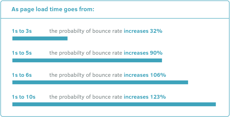
How long are you willing to wait for a website to load before simply navigating away to another source? On average, website users will only spare three or four seconds for a page to load—which means your site should be ready to go in two seconds or less. Any delay past the two-second mark can cause you to lose visitors at an alarming rate.

Test your page on different browsers and different devices to make sure it offers a consistent speed. Run a speed test to put some hard numbers behind it. And if your site is too slow to load, see if there are any design elements (videos or big images) that you need to remove.
Use Calls to Action
Every page of your website should have a call to action, instructing the user on what he or she should do next—whether that’s navigating to a different page, emailing you, calling you, buying a product, making an appointment, or whatever else.
This is important for conversions, but it’s also important for the user experience. Simply put, clear calls to action make it easy for the user to navigate your page and understand what’s coming next. Bonus points for creating call to action buttons that are bright and colorful, and that clearly stand out from the rest of the page.
Embrace Consistency
The user experience should be consistent throughout your website. This means matching up your fonts, heading sizes, colors, button styles, photo choices, design elements, and beyond. Make sure you have coherent aesthetics to tie each piece of content together.
This is more important than you might think. For one thing, variations in colors or fonts can cause you to look sloppy and unprofessional. Even more seriously, an inconsistent design can cause users to feel lost, or to wonder if they somehow navigated to a new site. That’s obviously not the impression you want to create.
Link with Care
Hyperlinks can also play a role in the user experience. Internal links are especially helpful; whenever you can, provide a clear navigational path to related resources—for example, service pages or blog posts that enhance or elaborate on the current topic. Don’t link just to link, though; each link you provide should truly be relevant.
External links can also be helpful, especially when they lead to impartial resources and supplementary information. Use these links with caution, however; you want to enhance the user experience without providing too many excuses for readers to leave your site.
Mind Your 404s
Finally, make sure your website doesn’t have too many 404 errors. Outside of a slow loading time, nothing will frustrate your users more than links that lead to nowhere, or pages that only provide error messages.
There are a number of ways to scan your site for 404, including some options in the Google Webmaster dashboard. If you have a very small site with only a handful of pages, you can even check your links manually to ensure they’re all working properly.
The bottom line: Remove anything that disrupts the user experience, and broken links are at the very top of that list.
Design a Website with the User in Mind
Your website is an important reflection of your business and brand—but ultimately, it’s not there for you; it’s there for the user. A good website provides a clear and easy path to helpful information, with minimal frustration along the way.
If you’re worried that your site offers a poor user experience, our team would be happy to take a look and offer some recommendations. Reach out to the enCOMPASS Web development team today and ask us about your options for improving user experience.
SHARE THIS ARTICLE:


