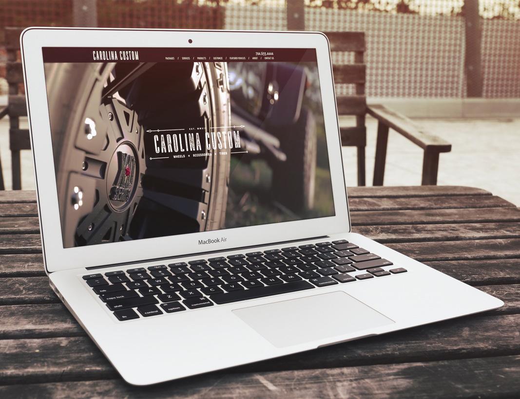
For years, digital marketing professionals have been beating the drum for mobile-friendly content. You’re probably familiar with the basic argument: These days, a majority of us access the Internet not through desktop or laptop computers, but rather via our phones and our tablets. There is ample data to support this argument, and thus it has become conventional wisdom that website content needs to be easily accessible from any kind of screen or device.
The question is, what does it look like in actual practice to create mobile-friendly content? Consider a few general tips and strategies.
Creating Mobile-Friendly Website Content
1) Make sure you write compelling introductions.
Keep in mind that phones and even tablets have relatively small screens, certainly much smaller than what you’d get with a desktop computer. The upshot of this is that, when someone navigates to your content, they’ll only have a chance to read a few lines of content, perhaps no more than a paragraph, before they need to scroll down.
Of course, your introduction really needs to grab the reader’s attention to entice them to keep reading further. Make the most of your intros by including engaging anecdotes, startling statistics, or simply a good, clear statement of value and intention.
In addition to offering your readers a quick intro, you might also consider beginning each article or page with a short-and-sweet summary, or a few quick bullet points, to let readers know what they can expect from your content. This is another effective way to grab and retain attention.
2) Keep paragraphs short.
When you’re reading content on a smaller screen, the presence of big, clunky blocks of text can be a little daunting.
You don’t want to intimidate your readers with impenetrable text. Instead, make it easy for them to casually scroll and skim. Keep paragraphs short and sweet, and ensure that each one focuses on a single main idea.
3) Consider how people actually consume content.
Does anyone actually read website content or long articles, word for word and line by line? Sure. But realistically, most people are skimmers. Your content should be developed with skimmers in mind.
Specifically, most online users fall into one or more of the following patterns of content consumption:
- They tend to skip the first few words in each line, especially when each line begins with the same words.
- Many readers also read headings and subheadings to get the basic flow of your content, but may skip the supportive text in between.
- Finally, many readers skip big blocks of text as they search for something more specific: An image, an infographic, a link, a CTA, a short line of bolded text, etc.
4) Include more than just text.
Let’s be honest: A page that’s nothing but text is pretty boring to look at, and potentially hard on the eyes.
That’s why mobile-friendly content development usually includes images and videos, which create some visual variety while also breaking up those larger chunks of text.
Videos and infographics can also be effective tools for summarizing longer chunks of content, so that your readers can hear your message even if they don’t have time to read your entire page.
5) Ensure fonts that are easy to read.
One of the most crucial aspects of designing mobile-friendly content is ensuring that your text is easy to read.
Most designers advocate for font sizes of 32 or more, which helps maintain readability even on small-screen devices. High-contrast colors are also recommended, not just for readability but for general aesthetics.
For example, white text on a black background is high-contrast, and takes less effort to read. Something like yellow-on-white, however, will require your readers to squint and strain. That’s the type of thing you want to avoid!
6) Be strategic with CTAs.
Your content should always include at least one strong call to action, exhorting the reader to take the next steps. (This may mean buying a product, signing up for an email newsletter, downloading a resource, etc.)
Mobile readers will want to find those CTAs as quickly as possible… and if they have to spend more than a second or two scrolling through your site looking for their next steps, it probably means you’re losing conversion opportunities.
Make sure CTAs are placed prominently, that they are clearly identified, and that your fonts and colors command the reader’s attention.
Also keep in mind that CTAs don’t always have to be at the bottom of the page. On the contrary, we’ll often recommend including them pretty close to the top.
Learn More About Creating Mobile-Friendly Content
As you consider your website content needs, make mobile-friendliness a foremost concern. And if you have any questions about exactly how to do that, we’d love to chat with you. Contact the enCOMPASS Agency team any time you have questions or concerns.
SHARE THIS ARTICLE:


